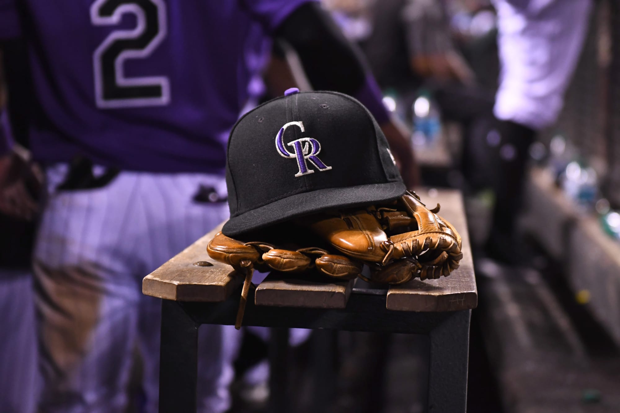
In case you missed it yesterday, social media was abuzz with the release of a new hat for the Colorado Rockies and MLB’s other 29 teams … and the buzz was anything but good.
New Era released its “Local Market” cap line on Tuesday and, by the end of the day, the hats were already no longer available online. Not because they had sold out, but rather that the company had pulled the line after all of the comments about the style and poor choices when it came to what was on the hat.
The hat was bad enough. The clip art hodge-podge was the icing on a God-awful cake.
In case you’re curious, here’s what the Colorado Rockies hat looked like.
Screenshots are forever. pic.twitter.com/KWMauoutMw
— Renee Dechert (@307Renee) May 25, 2021
So, if you’re keeping track, along with the Rockies logo, that’s a mountain, a Colorado flag, a mug of beer, and an outline of the state of Colorado with “1993” in it, symbolizing the year the Rockies came into existence. There’s also some script lettering with the state name and nickname on it. Yawn.
It was a swing and a miss in a big, big way.
What should have represented the Colorado Rockies on the New Era “Local Market” cap line?
First, have to agree with our friend Nick Groke in his thoughts on the cap here (in The Athletic, subscription required) that a marijuana leaf should’ve been on the cap somewhere. I know many will balk at what it represents, but there’s no doubt that marijuana and Colorado have become synonymous over the last few years.
How about adding the “Welcome to Colorful Colorado” sign that is stationed at many of the major entrances into our state? Plenty of pictures have represented it in vacation memories.
Throw in the Columbine flower, for goodness sake. There has to be a state flower on there if you’re talking about Colorado, right?
If you’re talking about Colorado, don’t you have to throw in the altitude somewhere along the way? Put a 5280 on there to represent Denver, or 14ers to represent the mountains rather than the clip art of a generic mountain. It’s so much better than the area codes that were on the front of the original hat.
Keep some reference to beer on there as well, but make it different than a beer mug you would find on a Milwaukee Brewers hat. If we’re going to claim we have the best beer in the nation, let’s figure out a way to give a nod to the craft beer industry in the state. Sorry, other 49 states, but Colorado does have the best beer.
Throw a peach on there for Palisade if this is going to be a “Colorado” hat. Put the Air Force Academy chapel or Olympic rings on there for Colorado Springs. Drop a Rocky Mountain National Park sign to give another shoutout to the amazing nature in our state.
Let’s get nuts and even throw Blucifer on there. Maybe on the back so people can have conspiracy theories about why it wasn’t on the front since anything to do with the airport and conspiracies go hand-in-hand.
Absolutely keep the Colorado flag on there. It’s an icon.
Not only did New Era miss the mark with the look of the cap, but what was on it as well. What would you have put on there to represent Colorado? Let us know in the comments below.
"local" - Google News
May 26, 2021 at 10:46PM
https://ift.tt/3uour5f
Colorado Rockies: What should have been on the New Era Local Market cap - Rox Pile
"local" - Google News
https://ift.tt/2WoMCc3
https://ift.tt/2KVQLik
Bagikan Berita Ini


0 Response to "Colorado Rockies: What should have been on the New Era Local Market cap - Rox Pile"
Post a Comment